A Space to Be
Shaker Library
Brand
Collateral
Creative Direction
Messaging
Shaker Heights has a deep tradition of community investment, and the library sits at the heart of it. When the Shaker Heights Public Library decided it was time for a rebrand, the goal was to build a complete identity system from the ground up: logo, color palette, typography, visual language, and messaging, all supported by strong positioning with a distinct and authentic brand voice.
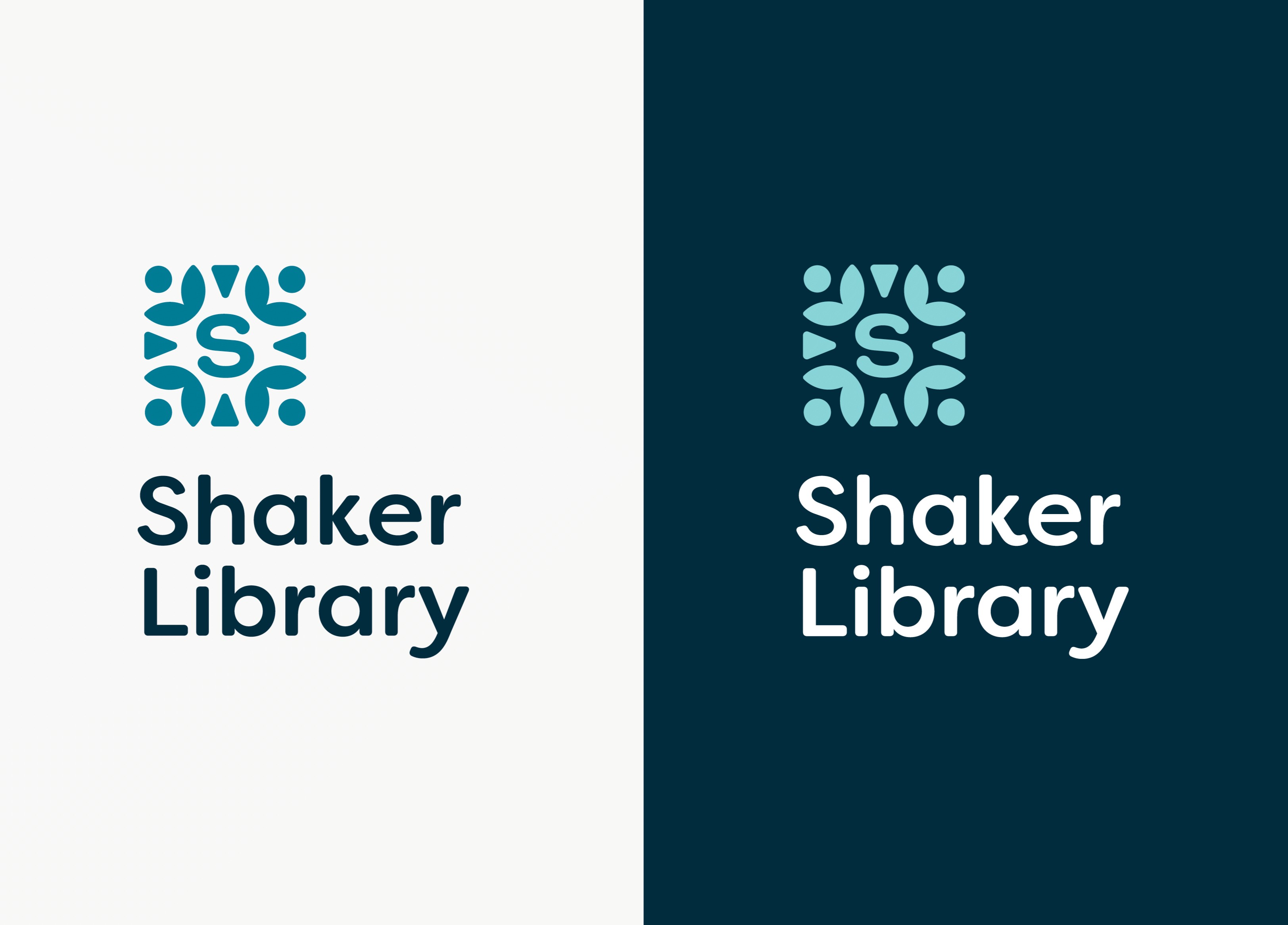
The logo pairs a distinctive “drop cap” mark with a clean, friendly logotype, with a system built for flexibility across signage, print, and digital. The color palette is warm, welcoming, and built with accessibility in mind.
The messaging was the foundation everything else was built on, centered around three themes: access, engagement, and transformation, and a single defining idea: the library is “a space to be.” Not just a place to borrow books, but a place to be yourself, to connect, to learn, to laugh, to belong. That idea shapes everything from the brand’s core positioning to individual headlines and how services are described. Ultimately the goal was to capture what a modern public library really is: a community hub that meets people where they are and gives everyone a reason to walk through the door.